
Excel Level 2: Conditional Formulas and Charts
Conditional format/formulas & working with tables
Excel level 2 goes over conditional formulas, charts, and more. Now let’s throw out some numbers and add some formulas, conditional formatting, and some rules;
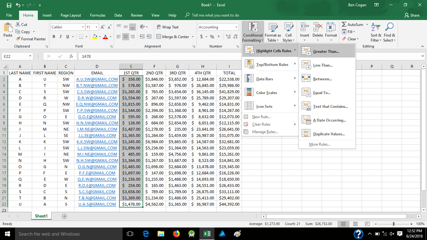
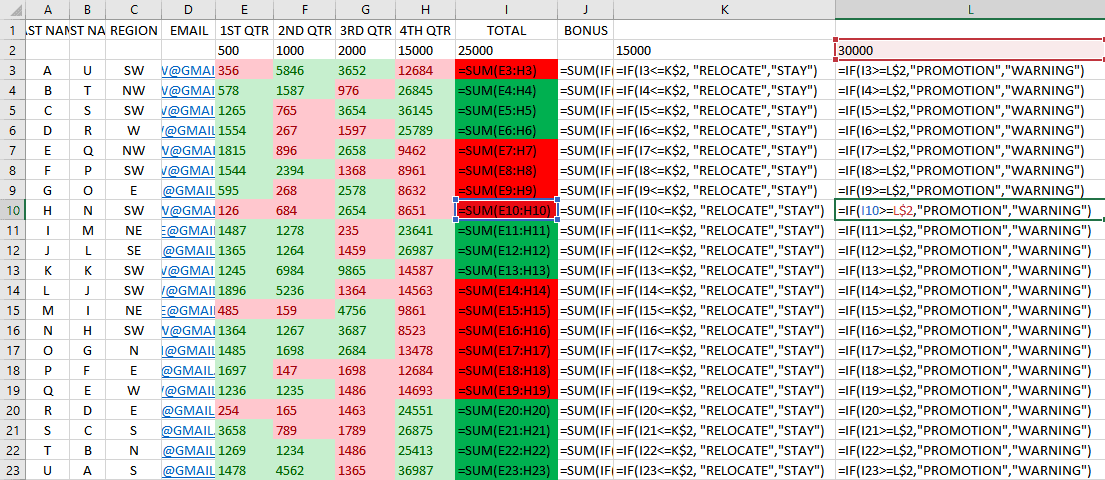
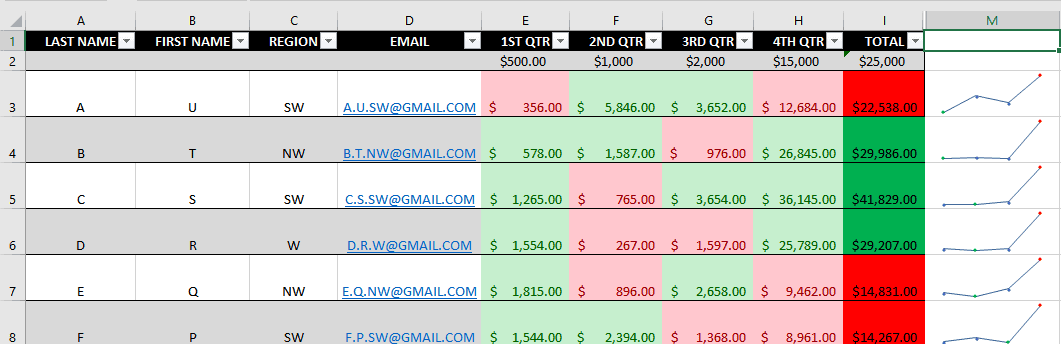
Picture this as a sales rep sheet providing their quarterly sales and annual totals, but it looks like a pain to differentiate cells, especially with a bigger list so lets set some formatting like inserting a new second row and adding monthly dollar figure goals, then I hid that row so it’s not distracting. Here we painted each cell green if it was over “$X” and red if it was under. Here were the values of each;
- 1st qtr greater than/less than $500
- 2nd qtr greater than/less than $1000
- 3rd qtr greater than/less than $2000
- 4th qtr greater than/less than $15000
- Total greater than/less than $25000
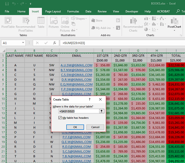
Let’s convert it to a table for easier sorting if necessary, here I also added a new 2nd row for sales rep bonuses. Highlight the whole area, insert table, confirm the data Excel picked as your data and go;
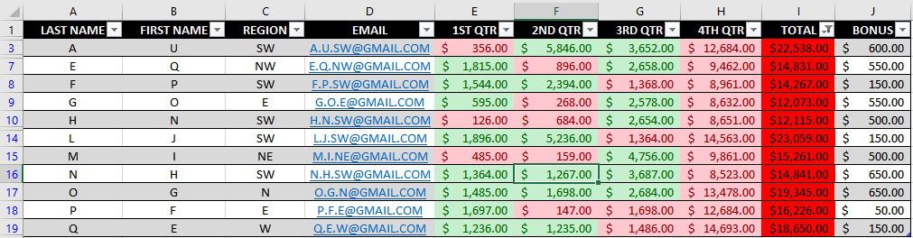
Now when in a table, there is a separate tools tab on the ribbon called “Design” when you go there you can change theme, style, and content of headers. You can see a chart on the upper right where you can change your table style. You can also see I added the bonus total, and some other conditional formulas for those sales reps.
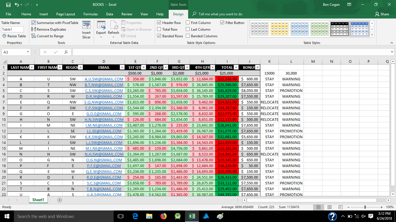
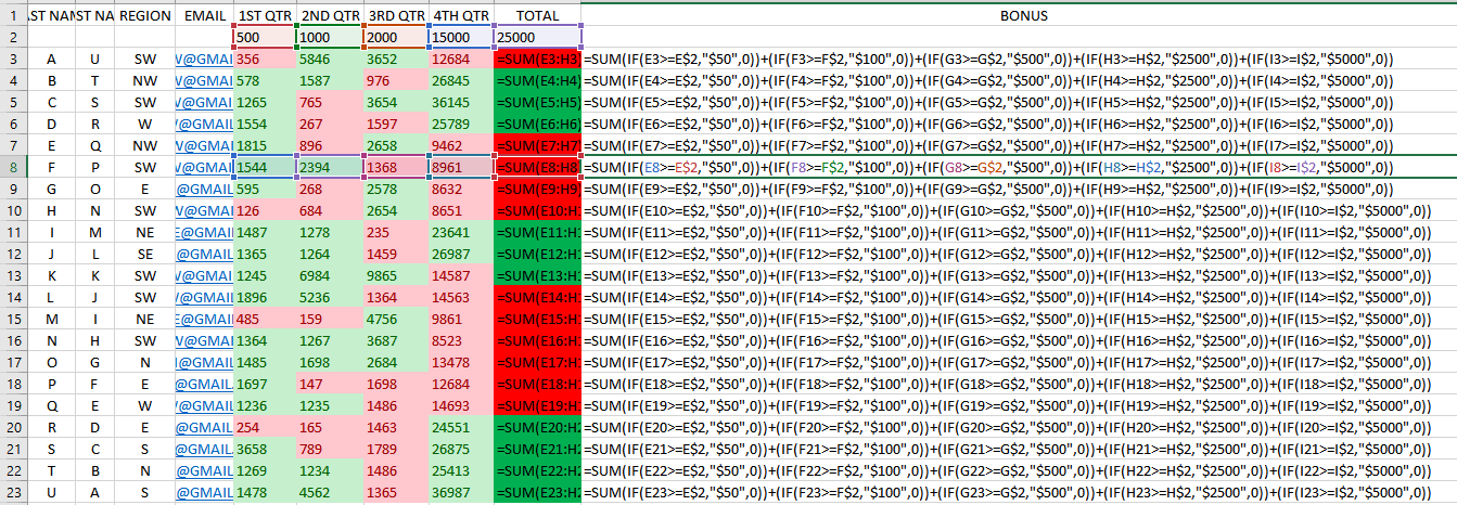
Bonuses are based off of their quarterly sales, the other conditional formulas indicate whether a sales rep did good or bad and will either be staying or relocating to a different region, and if they will receive a promotion or warning for their performance. Here are those formulas;
Now lets focus a little more on the table for easy sorting, here I’m clicking on the drop-down arrow of the “total” column;
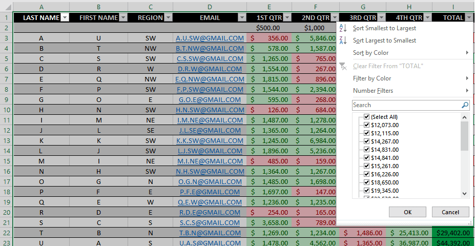
And we are going to sort by color, looking at only the lowest totals in red. You can play around with this and change by region, names, quarters, colors and even basic low to high/high to low numbers.
Excel Level 2: Charts
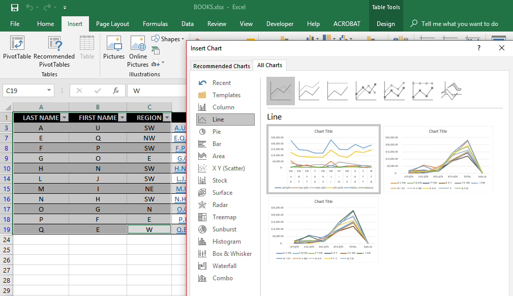
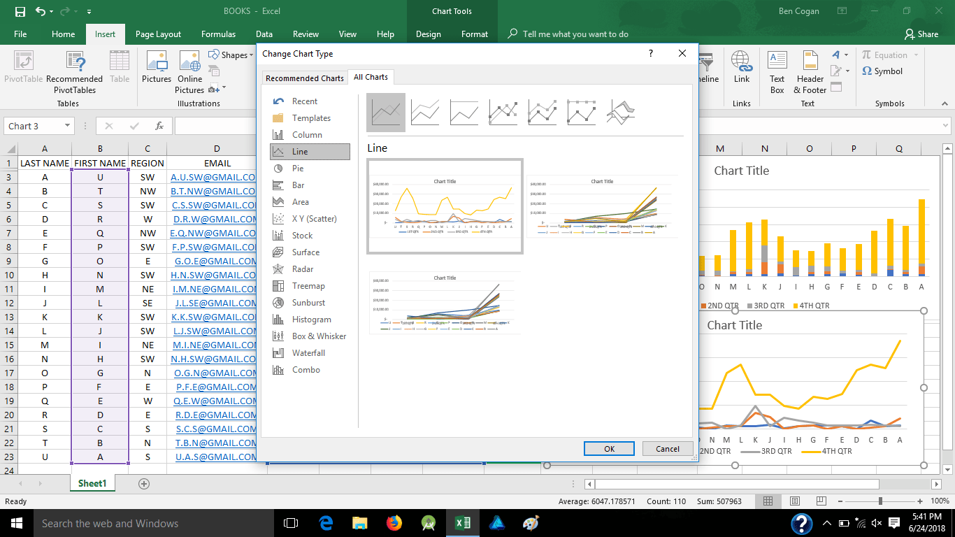
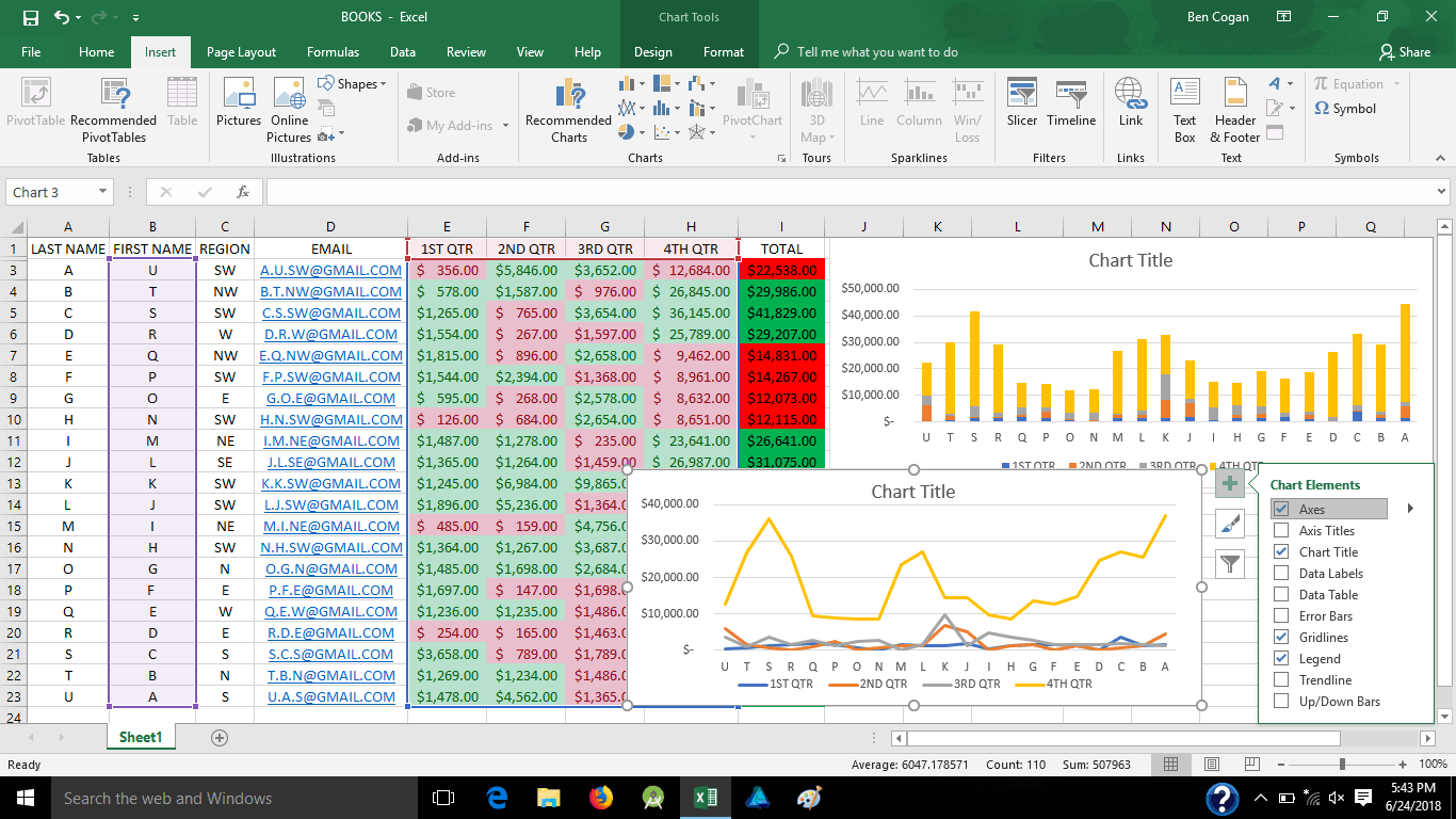
Now let’s add some charts to make it look a little better, highlight the area you want to chart out as well as the headers for the axis titles, then go to “insert” tab and click “recommended charts”
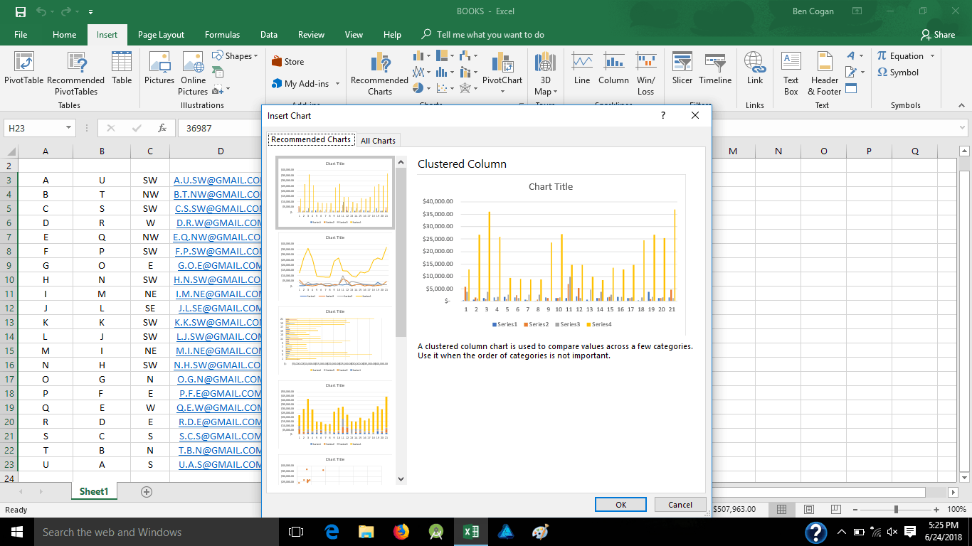
Here it will give you a list of charts it recommends will flow well with your data, we will just grab a simple bar graph, then pick the cell you want it to appear in;
And here it is;
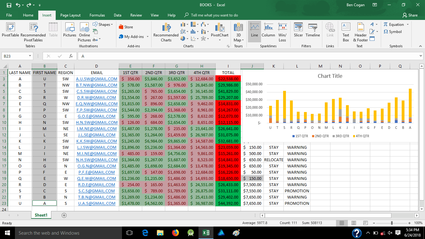
Now lets add another, this time a line chart;
and place it, if prompted
Now you can click on the charts and edit the layout and/or title
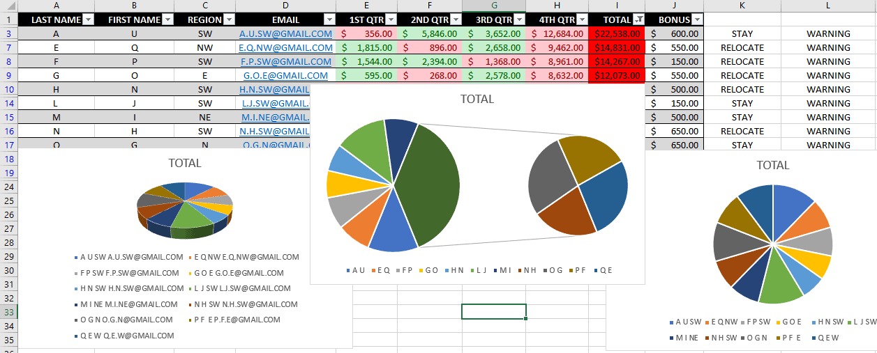
Here’s a few pie charts of the same data;
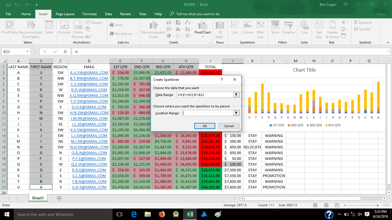
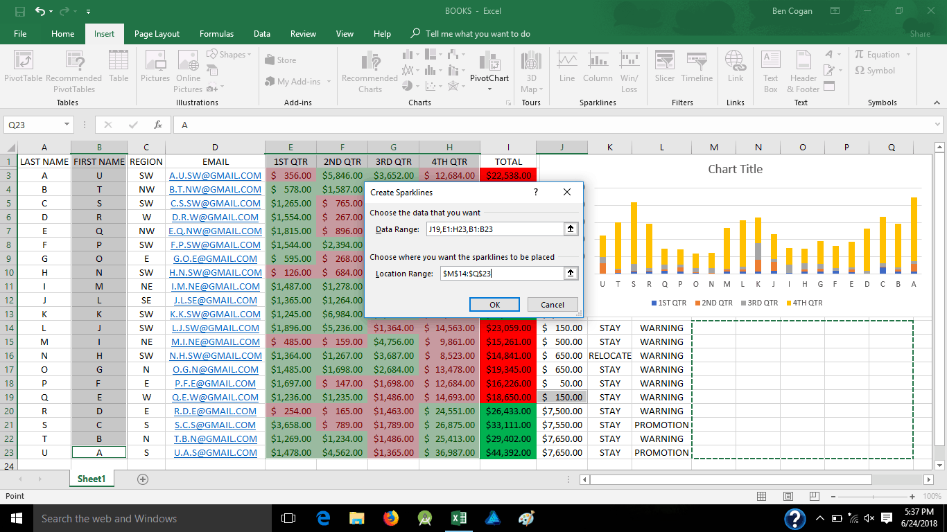
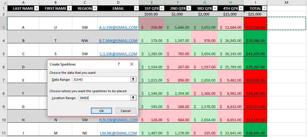
If you don’t like everything grouped together and just want a simple line chart for each person’s progress, you could easily do 1 for each line, just highlight the cells you want, add line chart (also know as spark-line) and place in the cell you wish them to go to;
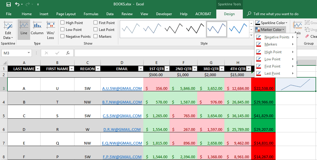
Now we add some style to it by coloring the line and marker points;
Notice that the “location range” when you pick where you want the line to go has the “absolute reference” ($), that means that once the line is set, if you go to the bottom right corner and use the black + symbol to copy it to the other cells, it will pick up the new data from each row, with markers;
Just that easy.
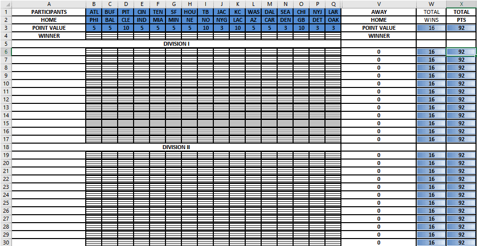
Football Pool Formula
Now let’s get back to conditional formulas. I learned these the hard way many years ago creating football pools. It literally took me about 7 hours to create. This was also because I had no idea about the absolute reference, I manually punched the formula in 20 times before I even realized I could copy that formula to word 100 times, then find and replace each number with the next number in line… hence why it took 7 hours. Here is that football pool for your reference;
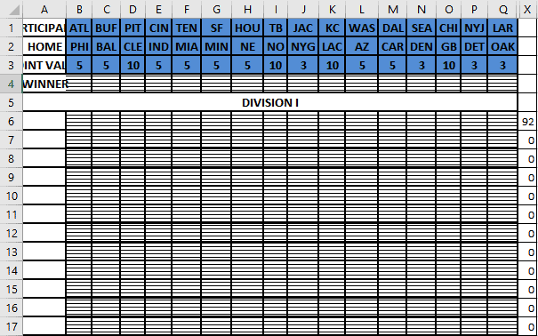
This is week 1 spreadsheet, there is a lot going on here from conditional rules, to conditional formulas, to even data point bars ranged so you can clearly see the difference between you and your opponents without looking at points tallied.
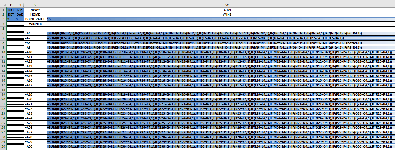
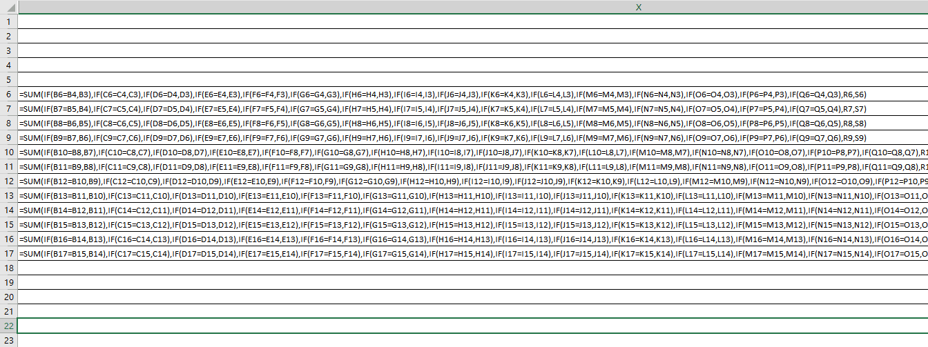
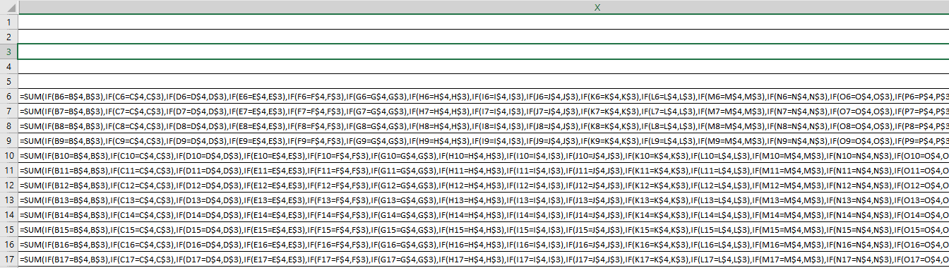
Here is the full formula for the total wins, (disregard the letters between Q and V, they were for a different format) this is my original formula, notice no “$” absolute references. This is how I got the 16 for total wins, 1 point for each game.
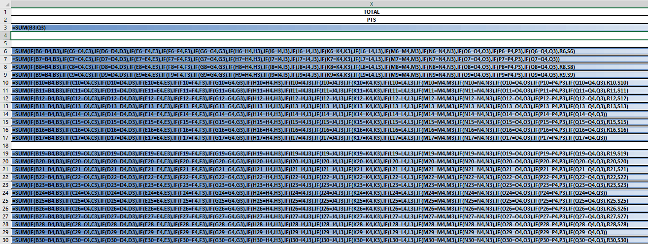
A little more complicated, here are the total points where each one is looking at cells matching to add the value found in row 3
Now lets start fresh, here I put in the one formula and spread it across the other cells, you can see only the first is accurate
Here is the formula side, this is what happens when you do not use the absolute reference ($) for these kinds of complicated formulas;
Notice it keeps counting the cells below, in pattern, now let me delete it all and go back to that first one and add the absolute reference ($);
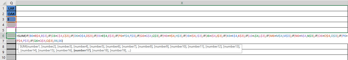
Now when I pull it down, I get the actual formula;
Here is the other end;
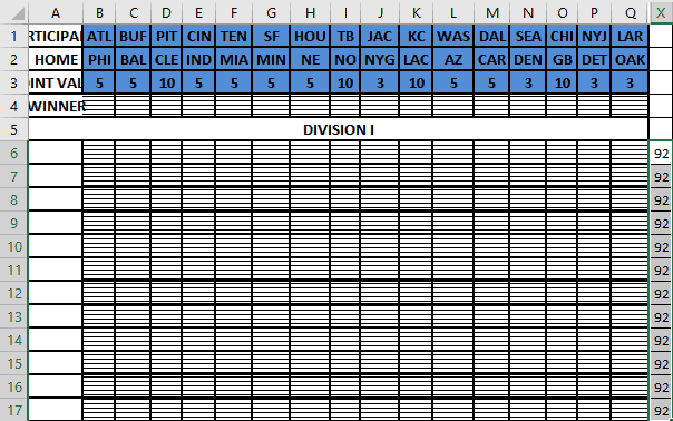
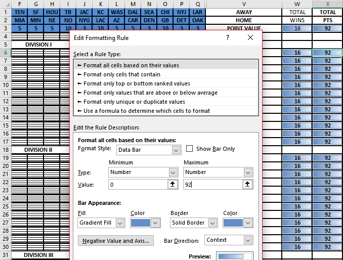
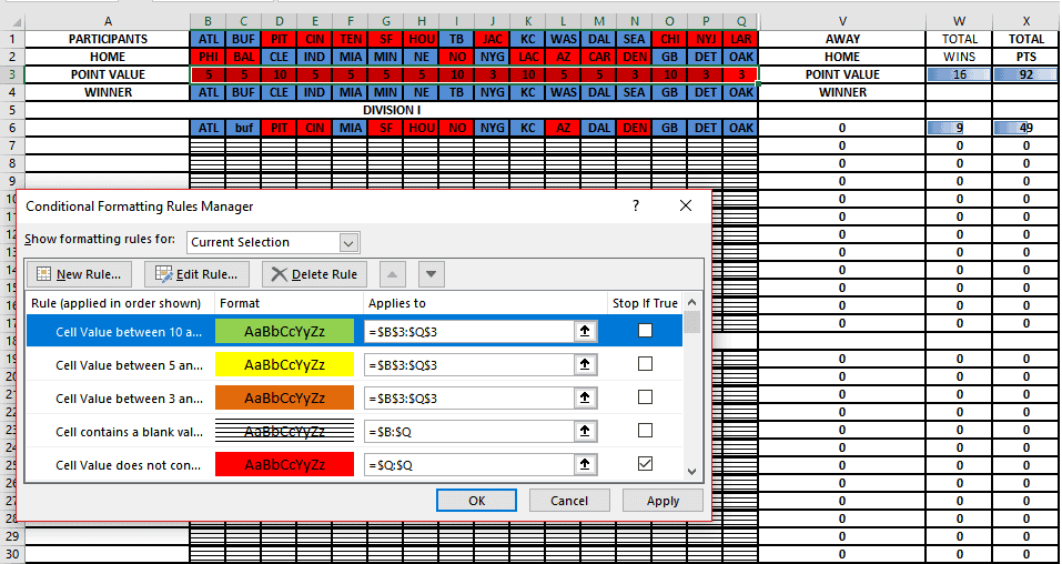
Now back to those data bars, we need to add rules for those;
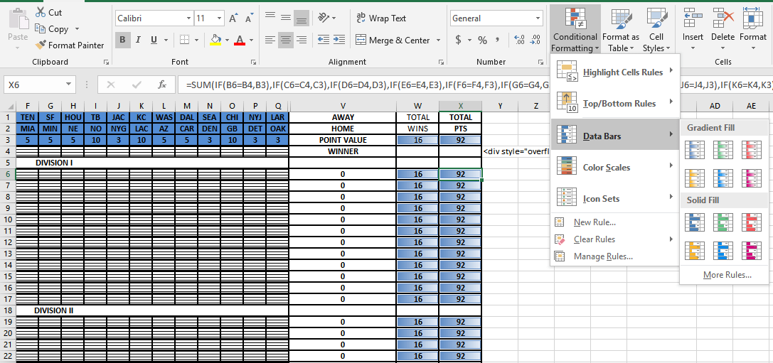
Under manage rules you can adjust the format style (Data bar) and adjust the number to minimum and maximum values. Here they were set 0 to 92, the most points you can get that week;
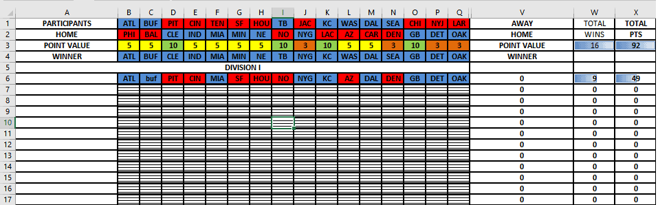
Now let’s fill in some winners to watch those bars in action;
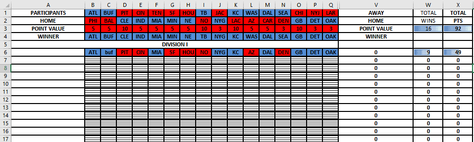
It was easier to add the rule of the “red for losers, blue for winners” with point value in tow but we want to set those different so we add more rules, this time I want the “Format only cells that contain”, and here I select “3” and fill it orange if 3 is shown.
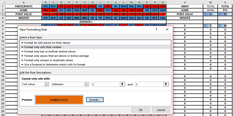
But I am not stopping there, I need to differentiate 5 and 10 as well so here are those rules;
And the final results;
That’s it. When I did this formula the long way, it paid for itself in the time saved but had I known then, what I know now, it would have paid off much sooner.
Now you should be a little more comfortable and less intimidated by conditional formulas and formatting, flash filling, tables, and charts so go play with your new-found skills and feel free to contact me below or at Ben@eagleyeforum.com if you have any questions or suggestions.
Coming Soon…
For our last level, we will learn how to take tables further into pivot tables, how to make a macro, 3D map and timelines, and drop down lists.


